

OVERVIEW
The Bloom Bunch Site
The Bloom Bunch a Toronto-based florist shop that offers delivery services throughout southern Ontario. The storefront website aims to offer floral arrangements for occasions of all kinds, including weddings, anniversaries and corporate events.
My Role
UI/UX Designer
Project
Personal
Timeline
2 Months
Tools Used
Figma, Adobe Photoshop
Responsibilities
Conducting interviews, paper and digital wireframing, low and high-fidelity prototyping, conducting a usability study, accounting for accessibility and iterating on designs.
The Problem
Online florist shops are hard to navigate, have inefficient browsing systems, offer little to no customizable options, and have unappealing designs.
The Goal
Design a responsive website for The Bloom Bunch that allows users to browse, order and pick up or get flowers delivered.

Online florist shops are hard to navigate, have inefficient browsing systems and offer little to no customizable options.
PROBLEM
THE SOLUTION(S)


Browse through categories to find pre-made, ready-to-go florals!
Browse and filter through florals by colour, size, occasion etc.
Pre-made florals take the guesswork out of the decision process
Update new categories according to the season and holidays


Customize your own floral arrangements.
Flowers can be selected and unselected to one's liking
Pick out the vase of your choosing
Multiple bouquets can be added to the cart


Pick-up and delivery options to fit busy schedules.
Bouquets can be delivered right to the recipient
Schedule and track florals from the app
Set and forget repeat deliveries to always have fresh flowers at hand.
USER RESEARCH
To build off of what I worked on creating the app version, I went online looking on florist websites to see what services and products were offered and how they categorized, filtered and presented florals.
Research Goals
Analyze the challenges people go through in ordering a bouquet under time constraints
Identify what frustrations come with ordering bouquets online
Discover what kind of visuals are used for both products and services
Identify the strengths/potential of current web systems
Discover how existing florist shops entice customers to choose them
Target Users
Event businesses, wedding planners/parties, city/ town folk, once-in-a-while buyers, flower lovers
Research Methods
Online survey (Google form)
Interviews
Online Research
WHITE PAPER RESEARCH
Online plant shopping is convenient and entertaining.
I wanted to figure out the goals and motivations of plant owners, so I went through articles and papers like this one from IOPScience to figure out that plant owners:
"surround themselves with natural elements such as ornamental plants in hopes of lessening the effects of mental stress... also saw their interest as either a main or an alternative source of income... (and plant owners) seek information and knowledge about plant care to maintain their interest and have their plants thrive within their homes."*
* S Reyes and N Navarra 2022 IOP Conf. Ser.: Earth Environ. Sci.
COMPETITIVE ANALYSIS
The way the competition presents information can be confusing or overwhelming.

FINDINGS
Creating empathy maps and conducting interviews (from the last project and this one) allowed me to understand users' wants and needs concerning visual design, products and services. A primary user group I identified through my research was business owners looking for online delivery services for floral arrangements.
I found that users wanted more custom bouquet options, subscription/ repeating delivery services and smooth navigation to browse through a shop's catalogue, all in one website.
USER INTERVIEWS

I conducted a usability study with 5 bouquet buyers to discuss their goals and pain points when shopping for florals online. The interview covered the entire user journey of buying a product.
Research questions:
Is the payment process easy and simple to use?
How long does it take for a user to find the right arrangement?
Is the information too deep within the website's architecture?
What elements should be adjusted or removed entirely across different devices?
What can we learn from the process users went through to order florals?
Are there any parts of the process to order an arrangement where users get stuck?
Some user feedback included:
"The text is kinda small in sections and some of it is difficult to read."
"Some of the buttons kinda look out of place, they don't really fit each other."
"I feel like there are pictures and text placed too close to each other."
With the research for the app, I synthesized the information into two behavioural archetypes (a bridal store owner and a young adult looking to send a gift back home) and an empathy map. I asked a few "How Might We" questions to figure out what direction to take The Bloom Bunch.
How might we organize and categorize pre-made arrangements?
How can we effectively communicate and display all our available delivery options, particularly to our repeat customers?
How might we present large sections of information across responsive websites?
How can we provide a seamless user experience and ensure users can easily navigate our platform across devices?
How can we create a cohesive design that can translate over multiple devices?
THE MAIN INSIGHT
Prioritizing consistency across design, clear interactions, and avoiding too deep navigation will allow for responsive compatibility across devices.
After analyzing the feedback through affinity mapping and referring back to the research, it is evident that users require easy navigation and adjustments to spacing and sizing, whether it be textual or visual.
PAIN POINTS
1
Overlays
Overlays with buttons didn't fit the screen correctly and the frames for the buttons were not lining up properly
2
Font
Some font sizes were too small, making it difficult for users to read.
3
Spacing
Some elements need more room around them to be easier on the eyes and allow for easy navigation.
STARTING THE DESIGN: PAPER WIREFRAMES

I created paper wireframes for the desktop size first and then moved on to the mobile size. I wanted to figure out how to properly format everything across the sizes.


DIGITAL WIREFRAMES
I polished and improved my paper concepts into digital wireframes. Digital wireframes gave me a more accurate representation of how the website would look and function on different devices.
USABILITY FINDINGS

I designed a high-fidelity prototype after conducting a usability study using the low-fidelity prototype with 5 users. To ensure a solid final prototype, I gathered and assessed feedback from the usability study. The aim was to evaluate the user experience while navigating pre-made florals, customizing arrangements, adding items to the wishlist and cart, and completing purchases.
Adjusted the font sizes and text styles to be more legible for on-screen readers.
I added more options to login into existing accounts below for easier login.
Lastly, I adjusted icon sizes in the navigation bar to look less cluttered and more in line with the menu.

Again, I adjusted the text sizes and buttons to be bigger for better legibility so they would be easier to click on no matter the device.
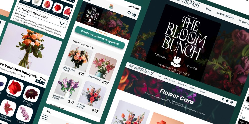
THE FINAL PROTOTYPE
THE STYLE GUIDE

Understand what and who you are designing for - That means listening to people and keeping your sights on your audience. I found that referring back to the research I collected and the interviews I conducted guided me through the decision-making process.
I'm never gonna get it 100% right - UX is not linear, there are multiple solutions to problems. Focusing on doing the best for who you need to serve is the key.
Don’t rush the process - Transferring the designs from the app to website was not the straightforward process I thought it would be. I soon realized that several areas required improvement, which made the process more challenging than I anticipated. I took things one step at a time, going back and forth to avoid frustration until completion.